home

These 6 things make your home look cheap, according to an interior designer.

You probably don't know this about me, but I'm somewhat of a house expert at Mamamia. 

If there's a rental crisis, I'm writing about it. A celebrity house tour? I'm recapping it. If there's something to say and there's a 'house' anywhere involved in the headline, I'm imprinting my mark somewhere. 

Have I done anything of note to make me an expert on homes? Besides living in them my whole life??? I rest my case.

And today, we're discussing all the things that make your home look rather... cheap. 

Watch: The Block's Shelley Craft's interior decorating for dummies tips. Post continues after video. 


Video via Mamamia.

What do you mean by 'cheap', Shannen? 

Well, before you crucify me, let me just say that I don't really care how people choose to decorate their homes unless they are a celebrity (because they have too much money and I'm of the personal belief they need to be humbled often to make them more likable). 

I understand how people are much too concerned with keeping a roof over their heads at the moment, rather than worrying about interior design. 
ADVERTISEMENT

But as someone who is also living in the rental crisis and is personally suffering from it, it brings me joy to make fun of things I don't like. 

It's not about who occupies a space. It's about what is in the space that makes it hideous. 

So when I say 'cheap', I don't mean 'bad'. I don't even mean 'wrong'. I simply mean 'ugly... to an interior designer'.

Take that as you will. 

Last month, famous luxury interior designer and content creator Bilal Rehman went viral after sharing the ways a home is made to look "cheap" through how they are interior designed. 

ADVERTISEMENT

Was he mean? Undoubtedly. 

But was he correct? Oh, yes. Absolutely. 

His video made me want to add my two cents because I have a whole lotta opinions. 

Here are the 6 things that are making your home look cheap. 

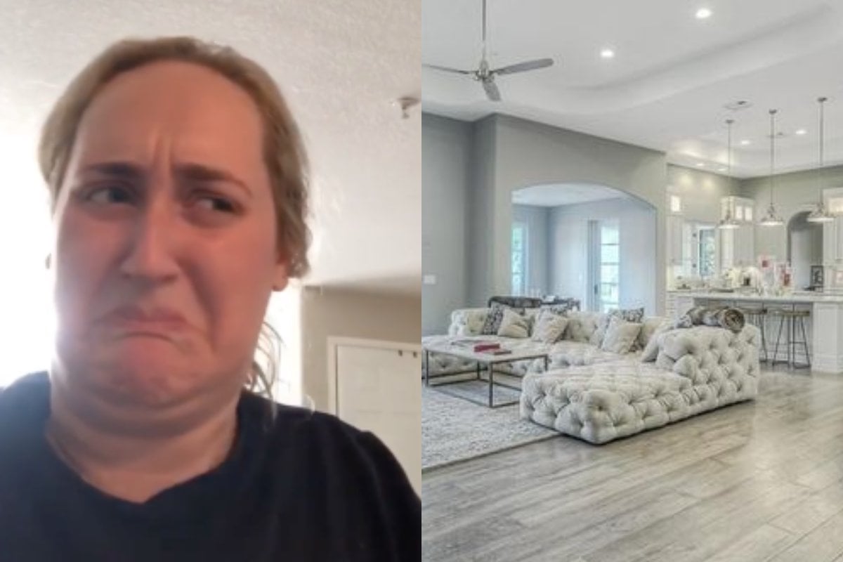
1. Grey wood floors. 

"Builders put this in every single home that they make," Rehman said. "It looks super basic. It sucks the life out of any space that you have and immediately devalues your space."

The interior designer noted that they're usually ripped out "nine out of 10 times" once an expert gets their hand on a property, so you're better off avoiding it in the first place. 

As someone who has lived in 23 homes over my short 25 years of living, I can attest and say that grey wood floors are not the nicest. 

But you know what's worse? Grey carpet. Not only is it hideous, it covers up spills, stains and god-knows-what-else until eventually it turns a mouldy-looking black. 

NOT! CUTE! 

2. Furniture sets. 

Rehman pointed out something I never could articulate well enough before watching his video. 

ADVERTISEMENT

Furniture sets are ugly. 

"There is no reason why your nightstands, dresser, bed, every single piece in your room matches," said Rehman. 

"It just makes the room feel like you went to one store and brought everything. It doesn't feel collected. It doesn't feel designer. It doesn't feel feel high-end so avoid furniture sets at all costs. I would say just choose one piece from the collection and stick with that."

Rehman is right. 

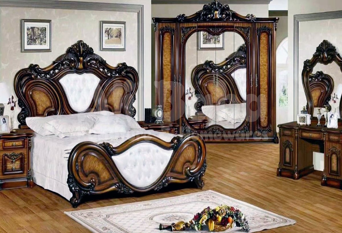
Sometimes a furniture set looks like this monstrosity. Image: Alibaba. 

ADVERTISEMENT

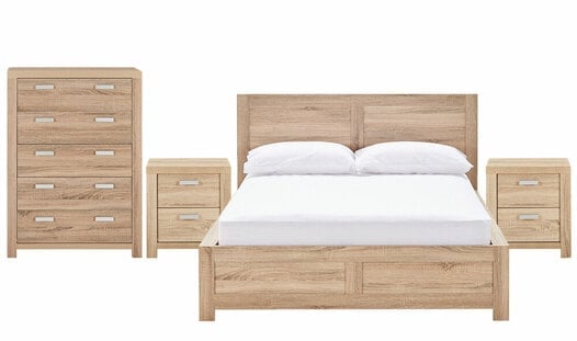
And other times, a furniture set looks like this. Image: Fantastic Furniture. 

It doesn't matter if the furniture set is black or white, $10,000 or $40. It doesn't look great when it's all together. 

ADVERTISEMENT

3. Mass-produced artwork.

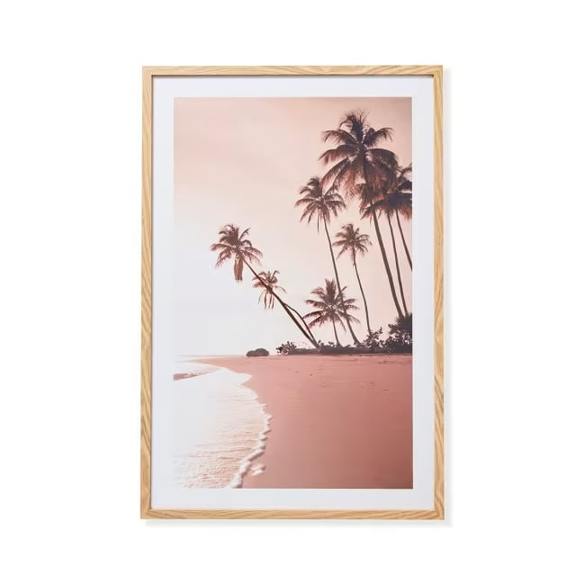
You know when you walk down the aisles of Kmart and see the washed-out palm tree prints or the line drawing of a naked woman's body? 

Well, those are called mass-produced pieces of artwork, and according to Rehman, they're f***ing ugly. 

"For the same price, you can easily find some really unique pieces from a local artist or Etsy or even make something yourself and in the long run you get a lot more for your money when you have a cool, original piece that no one else has in their house," he said. 

If you've got one, then so does everyone else. Image: Kmart.

ADVERTISEMENT

4. Fashion coffee table books you've never opened.

I'm not here to hurt anyone's feelings when I say this, but coffee table books are so overrated and as someone who has them, I push them onto the ground every night when I want to eat dinner. 

They are not as nice as we think they are. I'm so glad I admitted this to myself. 

5. Lino floors (where they don't belong). 

WHY ARE TILED PRINTS IN THE LIVING ROOM??? 

And why do I know you specifically bought them because you wanted your home to look like a cool juke joint from the '50s? 

I'm tired. Remove them, pls. 

6. Artificial plants.

I know. There are plenty of reasons why people have artificial plants. 

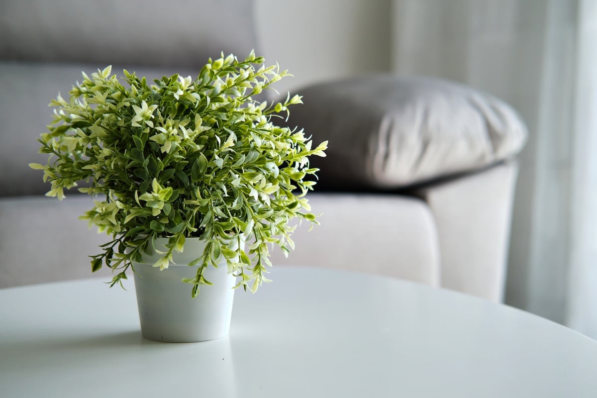
I'm talking about these ugly buggers. Image: Getty.

ADVERTISEMENT

For some, it's because they're rarely home but love the ~vibes of nature~ they give off. 

And for others, it's because they're useless at keeping things alive. I happen to fall into the latter category. 

And I'm ashamed. Because they're not giving what I think they give. In actuality, they make me look like a seven-year-old. 

But considering how hard it is being an adult, I'm starting to wonder if that's not such a bad thing.  

Feature Image: Pinterest/YouTube. 

Do you have any Streaming Video Services in your household? e.g. Netflix, Stan, etc. We want to hear from you! Take our survey now to go in the running to win a $100 gift voucher.

00:00 / ???