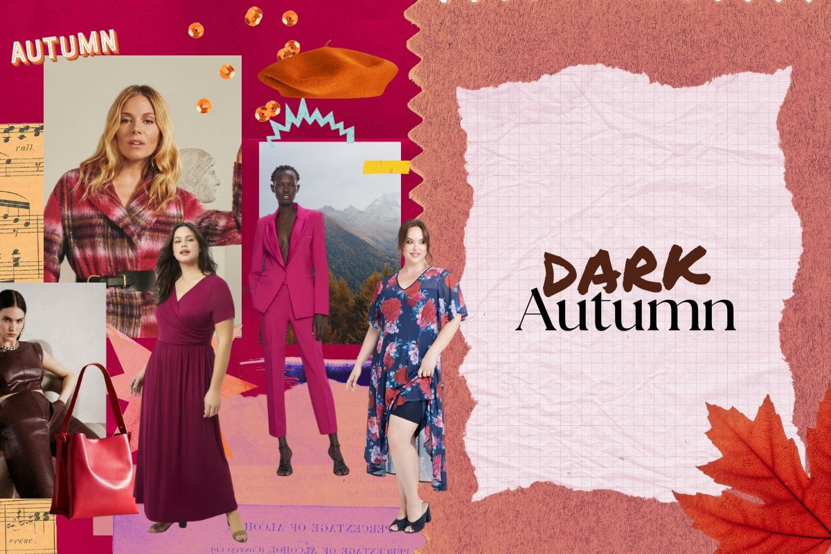
Picture a luscious forest, a garden filled with ripe fig and plum trees or the very last moments of a sunset. This is dark autumn.
Also referred to as deep autumn, this colour palette sits in between true autumn and dark winter on the seasonal flow chart and is characterised by its rich, deep, earthy and mysterious tones that blend the warm hues of autumn with the intense shades of winter.
How to tell if you're dark autumn.
Dark autumn is categorised as the following: medium-warm hue, dark value and neutral chroma.
Medium-warm hue: The colours lean towards the warm end of the scale without being extremely warm. This means yellow undertones are predominant with blue tones (the coolest colour) only appearing in warmer shades, like turquoise and greenish blues.
Dark value: Depth is key with all dark autumn colours. In saying this, there are also lighter and medium colours in the palette, which help create a harmonious contrast.
Neutral chroma: Colours are neither extremely soft and muted nor extremely bright and vibrant. They fall right in the middle of the scale.
Watch: Your street style at Australian Fashion Week. Post continues below.
What is dark autumn's colour palette?
Deep autumn's best colours include:
Neutrals: Cream, camel, mocha and ash
Red, orange and pink: Rust, copper, cinnamon, crimson and boysenberry
Yellow and green: Honey, mustard, olive and forest green
Purple and blue: Mulberry, plum, dark teal and navy
On the flip side, the colours to avoid if you're dark autumn include: